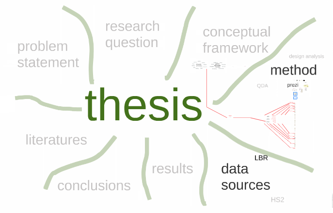
Some time ago, at the height of what might come to be known as my “Prezi-mania”, I was working on how to turn my continuing use of Prezi as a presentation tool into something that might help me to explore and represent the data that was underpinning the development of my thesis. This led to a series of studies in Prezi that looked at how to use its pan and zoom and overlay facilities in ways that I had not previously considered.
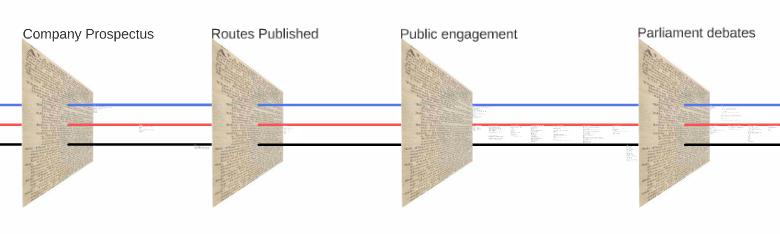
One study brought together a collection of archival documents that were kind of coded. These had themes identified from a reading of the text and laid over the top of the facsimile document as a way of visually pulling out the essence of the document. Most of the documents in question were newspaper reports of meetings from the 1832 London and Birmingham Railway debate and it seemed that these “essences” might be blended together as a series of meetings took place.
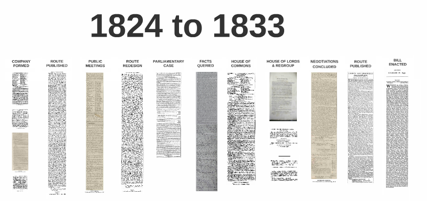
The next study took a more severe retro software aesthetic turn and focussed on more detail in the elements that could be identified in a series of meetings.
http://prezi.com/allagxwrsdox
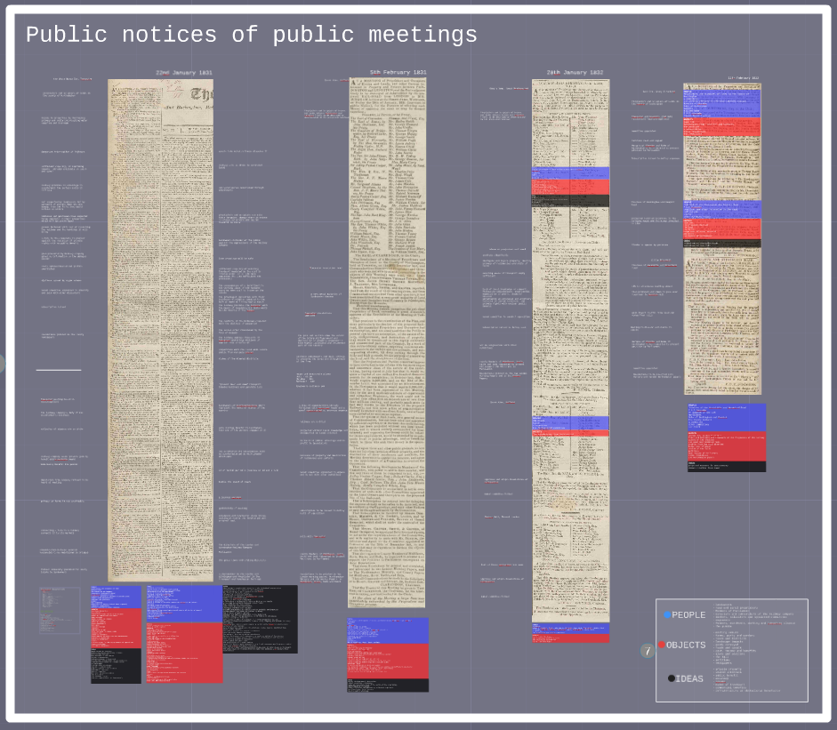
And having finally sourced a copy of the Ken Garland game of “Connect” it was natural that these elements should be traced between meetings by the red, black and blue lines of his surrogate tube map. Let’s say Red for the People, Blue for the Objects, Black for Ideas. Inadvertently, and in the context of recent moves within the Labour party, this scheme seems to also map some kind of political landscape quite well. I’m not attached to this schema as a representation of the data, a dose of ANT helped to mollify the urge for blunt categories, but we might keep the red (or black?) flag flying here for a while yet.
http://prezi.com/r6ijna6d8ysp
But Prezi doesn’t really step up to the mark when it comes to analysis in the way that software like ATLAS.ti or nVivo does. The text handling is poor. It doesn’t like having a 3000 line text object on screen. At all. The search facility is absent. There is no theory builder or codebook.
But there still seems to be something in it that hasn’t quite been exhausted. The wide open canvas, the free panning and zooming and the lack of a constraining conceptual interface is compelling. It’s like something from the sixties.
The interface it does have can be a little fiddly when you’re trying to select and move very long and thin lines around the canvas for example. But these limitations can be worked around and the freedom of movement and thought that it provides is a great way of familiarising yourself with your data.
The full text of the articles can be read at full zoom. And at the other end of the scale, of building up a picture of what this data might mean to your research where a thesis map can be built as an overview that contains the theory, the data and the results. It’s like walking into the hut where Carlos Castaneda sits with an old woman and the perspective lines of the floor shift around and give way to the soaring clouds of a shamanic imagination. Sort of…well, it supports some kind of creativity anyway. It also gives you an online presentation of your work as a free bonus and a collaborative platform if you want to build stuff with colleagues or share with supervisors.
I’m not quite sure I’ve fully explored its potential yet and as thesis writing deadlines creep ever closer (whatever happened to that third year? whatever happened to today?) I’m not sure if I will manage to do so in the next few months.
But I have been invited to present some of these ideas at the International Visual Methods Conference in Brighton next week (September 16-18 2015).
http://prezi.com/vumvl8dp0f5u
Could this be a reprieve for temps passe, a swansong for a passing fad or the renaissance of our inner shaman?