Academics are interested in the dissemination of research outcomes – it’s one of the measures that is used to assess their (institutional) income. And social scientists (probably all academics but I’ve been hanging out with the Geographers) are increasingly interested in creating visual artefacts as a method of dissemination. They’re also interested in the analysis of visual artefacts as a method. The presence of the same words in the two previous sentences allowed me to, quite lazily, conflate these two concepts whereas, somewhere along one of my many roads to many Damascii, I came to realise that obviously the two concepts are almost the opposite of each other.
The analysis of visual artefacts, the methods of which are extensively and elegantly detailed by Gillian Rose in her soon to go to a fourth edition “Visual Methodologies” book, treats images as texts that can be interrogated and analysed like any other data. You don’t have to go very far before you bump into John Berger or Roland Barthes to see how this works. In an increasingly image-centric culture the separation of these methods becomes increasingly irrelevant: in order to be satisfied with our research outcomes of course we need to analyse the visual alongside any other relevant artefacts.
By the same token, but in the opposite direction, this increasingly image-centric culture makes it increasingly easy to generate visual material that can be used to represent data and disseminate results. Big data visualisations present abstracted and often aesthetic representations of more information than you could previously only just imagine – a bit like everybody suddenly being able to shout (or draw) an unpronounceable tetragrammaton. Tools developed by ubiquitous behemoths like Google allow everybody to have a go. Here’s one I made earlier.
On the one hand the analysis of artefacts looks like art history where a painting is treated as an object for study, possibly in relation to other paintings or to the circumstances by which it was produced. On the other hand, in generating their own visual materials, the academic takes on the role of curator or creator and becomes the artist. Art theory merges into studio practice.
It’s a well established concept in design studies that the production of the visual artefact, sketching in particular, is an intrinsic and valuable part of the design process. The architect for example sketches the current state of their design and reflects on this as they move towards the next phase of resolution. They might do this with their client perhaps as a way of including them in the design process or as a demonstration of their professional prowess with a flourish from a Rotring pen.
How does this scale up to academia? How does the production of the visual fit into the research process and the dissemination of results. Is it a product or a process? And if it’s both how do they interact? And who is the client? Is it other academics? Funding bodies? Or the general public? No doubt it’s all of the above but again how do they interact? And most pressingly perhaps, in this visual-centric world, do we need to be conscious of the brand of pen that we pull out of our pocket in order to impress them?
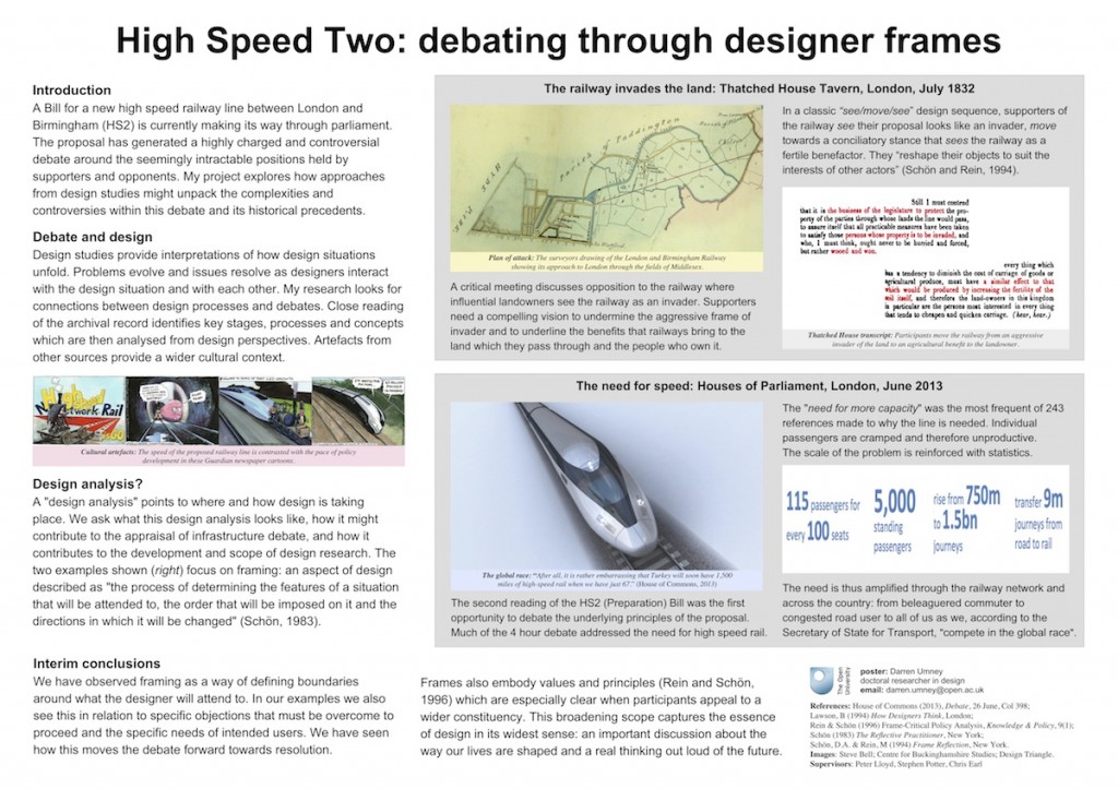
In contrast, and by way of contextualising the above, it is the Open University post-graduate student poster competition this week and I left my designer pens at home:
